With Youtube and Instagram, you don’t need data to prove that visuals are more engaging and converting than written content. This is because visuals are easy-to-digest, and brains can process visuals 60,000 times faster than text.
But, many marketers avoid using visual content in their marketing because it’s time-consuming and more expensive than a traditional blog post. In this guide, we want to dive into visual content marketing and make it easier for you to implement visuals within your everyday marketing plans with our favorite visual creator— Canva.
Before we dive into Canva and how you can use this design tool for your B2B content marketing strategy, let’s understand why visual content is important.
PS. If you’re looking at creating a logo for your online business, read this guide on using Hatchful by Shopify.
Introduction to Visual Content Marketing
What is Visual Content Marketing?
Visual content marketing uses images to convey information in an engaging manner. Your visual content can be as simple as a meme, added to make your articles more interactive or a video that your audience is surely going to pay attention to.
For your run-of-the-mill articles, marketers can include an infographic in their blog to provide variety, making their article a little less wordy and more engaging. Besides that, marketers can create visual content that can easily be shared across different social platforms from Instagram to Youtube to Reddit.
Why is Visual Content Important?
In a world with short attention spans, visual content is your best solution is gaining traction. In fact, incorporating visuals into your articles has proven to bring 94% more views. This is because visual content helps you to better index your content within search engines. Readers are also likely to read more when they have digestible visual content to look at.
Visuals play a crucial role in every marketing strategy because of how easy they are to process. Your brain processes visuals 60,000 times faster than text and 65% of this visual information stays with you 3 days after you’ve read it.
So, if you aren’t adding a variety of visuals within your B2B content marketing strategy, you are missing out on an opportunity to engage your audience more meaningfully and easily increase your views.
Types of Visual Content For Your Marketing Campaigns
When adding more visuals into their content marketing strategy, marketers need to first prioritize revamping their blog content. Your blog posts can’t be just paragraphs of text with no breather for the reader. Instead, you can make your articles more appealing by adding relevant and fun visuals. This can be as simple as a comparison visual, an animated GIF, or a screenshot of a dashboard, or even shareable visuals like infographics.

But, visual content isn’t just limited to your articles. Beyond the visuals you add to blogs, it’s important that you think about creating and sharing visual content about your solutions on different platforms.
Social media platforms like Instagram, Facebook and Twitter are filled with visual content. Marketers have smartly used visuals, even in their interactions with customers to provide a conversational tone to their brand. And it works!
Tweets with images are 34% more likely to get retweeted than tweets with no images.
For marketers who have more resources, video converts best. With 2 billion users, Youtube is a goldmine for marketers to capture new audiences and create a steady following that you have the opportunity to convert into customers. The intent of the audience on Youtube is also high. 68% of YouTube users have watched a video to help decide on a purchasing decision.
Planning Your Visual Content Marketing Strategy
It may seem a little daunting to get started with visual content so we’d like to help you strategize your visual content requirements to simplify the kind of visuals you need to create and help you get started instantly.
Step 1: Add different kinds of visuals to your blog
You can look through your older blogs and list down the different kinds of visual content that would fit into the article. You can transform a list of tips into a well-designed checklist, put all your stats into a visual flow of information, add examples of what another brand has done, show examples of the right and wrong way to do something, etc.
Once you have noted these down, you can spend a week creating these visuals, adding them to your blogs, and increasing their rank on search engines.
Step 2: Turn blogs into visual content for social sharing
You can condense the essence of your blog into easy-to-digest social content, like an Instagram carousel. By doing this, you can repurpose your content into different formats and share it with a new audience without putting too much effort into planning.
Here’s an example of an Instagram carousel post:
View this post on Instagram
Step 3: Think of the goal you want to achieve with the visual content you create
Every piece of content needs to have a goal in place. You can choose whether you want to show your clients how to solve their problems, explain how your solution works, educate your audience, or promote your brand. Once you have a goal, you can create highly specific visual content that will help you achieve that goal faster.
For instance, if you want to educate about eCommerce marketing, you can then go on to create videos, infographics, and Instagram posts about the topic.
Step 4: Create bite-sized videos without too much hassle
Your videos don’t need a full production team or a huge budget. You can create simple explainer videos that record your screen while you explain how to solve X or tell your audience about hacks they can implement for greater results.
Moreover, you can create text-based videos that compile images and gifs to convey your message faster.
Read more about how you can use video for B2B content marketing with our complete guide.
Once you’ve planned out what kind of visual content you want to create, you don’t need to fret over finding the perfect designer! Instead, you can use Canva to design your visuals from scratch, optimize your designs according to the recommended sizes, and execute your visual content strategy with ease.
Canva for Visual Content Marketing
What is Canva?
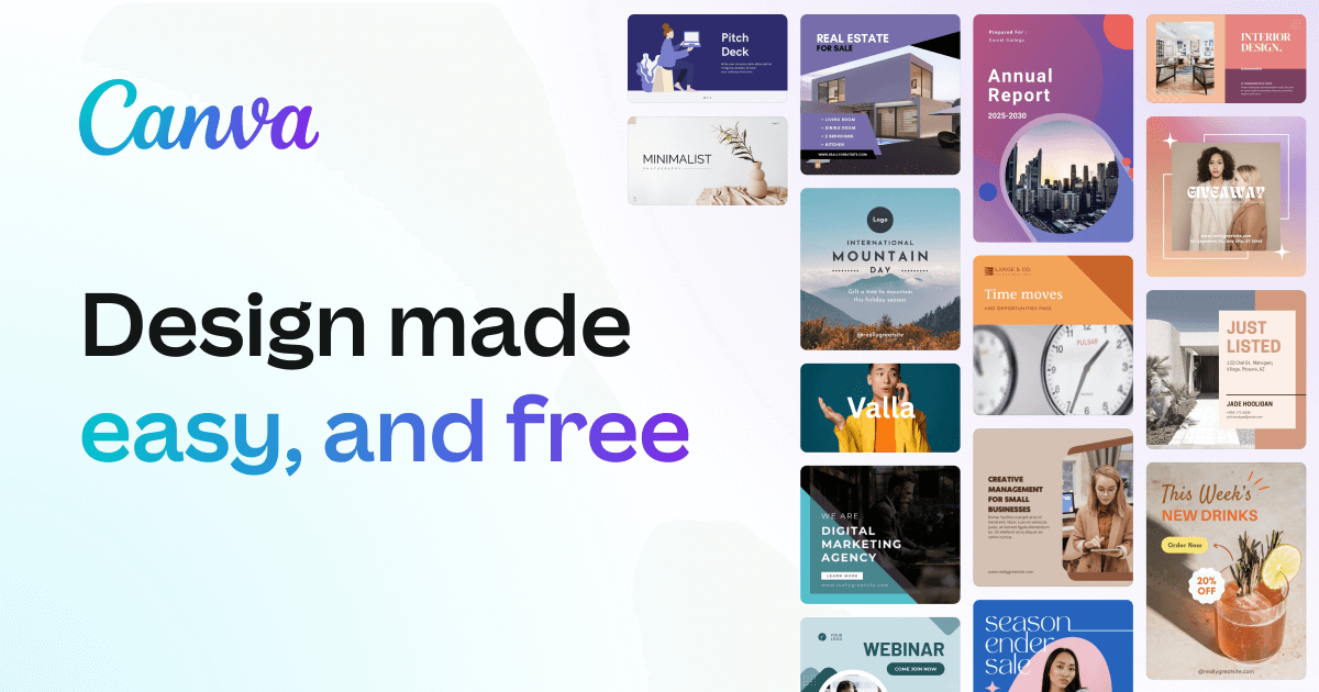
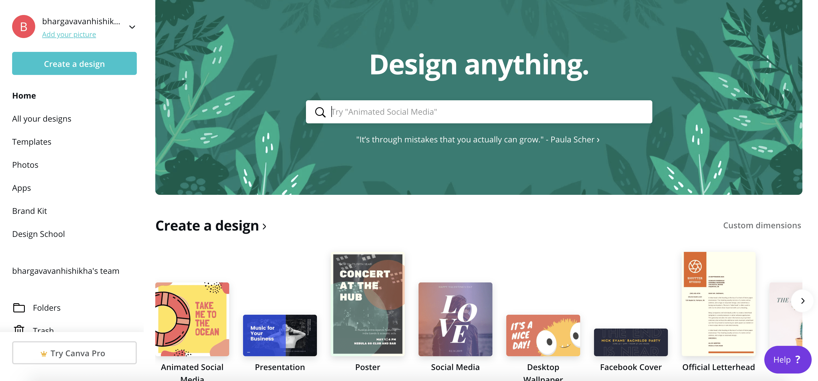
Canva is a graphic design tool that simplifies design for non-designers. This drag-and-drop tool has a library of photographs, vectors, fonts, graphics, and images to make it easier for anyone to put together a design for their different requirements. Canva is commonly used among marketers, helping teams to lower costs by simplifying design and making it accessible to all.
Why Canva?
With template inspirations and easy to use design-builder, Canva is time-saving and even lets non-designers come up with beautiful designs for their visual content marketing needs. As of 2018, Canva has 170 million active users. It is especially helpful for new or small businesses than have a one-man marketing army.
Moreover, the design tool is friendly for teams. Their designs can be stored in a team account, making it easy for team members to access other designs to make edits as they require. This shareable feature also makes it easy for people to collaborate together on designs even if they aren’t in the same room.
Canva Templates for Successful Visual Content Marketing
Canva has ready-to-use content formats in the right dimensions so that you can get started with your design right away. Here are templates that we absolutely love using:
1. Social media
Canva recently launched a new content format that lets you create animated social media visuals. Animated social media posts act like video— they start playing automatically and viewers are sure to stop, engage with the visual, and even interact with your post. These animated posts would even have higher engagement rates on different social media platforms like Twitter (10x engagement), Facebook (3% higher), and Instagram (21% more than photos).
View this post on Instagram
Besides animating your social media visuals, marketers can repurpose their content for different social media platforms. Canva has templates for each platform that are optimized by size to make it easier for users to quickly put their design together without fretting over whether it would get cut off on social media.
One content format that is a must use is carousels for Instagram. As a rising visual-centric platform, Instagram is a great place to attract new audiences and carousels especially are perfect to get audiences to interact with your posts more. By taking advantage of Instagram’s carousel feature, marketers can provide their viewers with an interactive experience.
2. Blogs
Making your blogs engaging is just as important as making them useful. You don’t want your readers to drop out of your site because of an overload of text. By adding relevant visuals smartly, you can ease your readers into your content. Add blog banners to give your blog page an impressive start. Most templatized blogs require a blog banner so that the article is indexed. Here’s how our blog banners look:

You can even consider condensing the most important topics into a checklist to allow readers to download your visual for later reference. Another great visual format to add to your blogs is an infographic. Infographics use design to present information in a more appealing manner. You can create an infographic for stats, a list of best practices, fun trivia, and more.
3. Advertisements
Canva has custom templates for Facebook ad graphics and different kinds of search ad formats to simplify your ad design requirements. Earlier, marketers needed to hire design specialists for a templatized ad graphic. With Canva’s ad formats, marketers can easily pick the template of their choice and customize it to make it their own.
4. Emails
Most email service providers have an in-built template library but most of the good templates are locked behind an upgrade. But, you don’t have to compromise on your email’s design just because of this limitation.
Canva has email content formats to let marketers put together a pleasing newsletter to send out to their email contacts. With logically-flowing email templates as well as styles for different marketing requirements, you never have to worry about putting together inspirations. Canva saves time with its customizable and highly specific templates that fulfill each of your email objectives.
5. Presentations
Marketers don’t have to rely on the overused Powerpoint templates anymore! Instead, choose from a range of presentation styles, from ones with paragraphs or texts to ones that are suited for image-centric decks.
Marketers must nail the look and feel of their presentations. A ready-to-edit design takes away the need to focus on perfecting the smaller details of the design and marketers can instead focus on content.
Best Practices for Creating Visual Content on Canva
Canva is easy to use and its versatility with multiple content formats makes it easy for anyone to whip up a design and share it without going through multiple revisions.
When you start designing on Canva. It’s also important to have these best practices in mind to help you design quicker and better.
1. Keep brand identity consistent
Your visual content must represent your brand. This means font, colors, and a logo that makes it easy to identify and find your brand.
You can start by setting your brand’s colors, logo, and fonts within Canva’s settings under ‘Brand Kit’. If your brand colors are limited, you can even choose 2 or 3 colors besides your brand colors to help you establish an aesthetic visual presence online.
Next, choose a fixed position to display your logo on each design. This designated logo space makes it easy to help you design your visual content without the logo being the last priority.
Here’s what the Brand Kit page looks on Canva:

2. Maintain fewer fonts for consistency
Fonts are a crucial part of any brand’s visual identity. You can use the fonts you’ve already set for your brand or pick 2 fonts that complement your brand. This is because having more than 2 fonts can make your design look less consistent.
The fonts you choose have to be easy to read. Most brands choose a thick font for headings and a readable sans-serif font for their paragraphs.
3. Use templates and different post formats to add variety
Canva’s extensive template library provides different post styles. Grab inspiration from these templates to make your visual content less boring. These templates are styled in different ways to break the monotony.
You can juggle between a straightforward templatized design, a carousel format, and an animated social media post— three easy-to-create post formats.
Check out Canva’s templates here.
4. Mix images into your design
When it comes to design, sometimes, you don’t need too much fancy to nail your visual content. If you think your posts feel try-hard and lack a human element, switch your tactics.
Mix an image into your design to convey a message. Such designs would be great for testimonials as well to add a human touch to the copy on the image. Another way marketers add images into their designs to create engaging visual content is by sharing an image along with a question to engage with their audience on social media.
Here’s what we created on Canva to show you how we would create visual marketing content for our last post about Trello

5. Add elements and vectors
Don’t just slap a few words onto a design and call it a day! Canva has a library of elements— shapes and illustrated designs— to help you add more splash to your design. Adding an element to your design will help you narrate the story/message more easily to your viewer. It can be as simple as a single vector of a bar graph or a full-framed illustration showing a person viewing their analytics dashboard.
B2B Brands Nailing Visual Content Marketing
With its complicated algorithm, Instagram is a tough place to engage your audience. When you’re a B2B brand, it gets tougher. There are even fewer people searching for B2B solutions on Instagram. But this doesn’t mean you can’t grow an audience on this image sharing platform.
Here are five B2B brands that are creating stellar visual content on Instagram to successfully interact with audiences.
1. Publicity House
Publicity House creates content to prove their credibility to their audience. Their content is centered around providing information and tips on what they do best— marketing. They also post questions to their audience to engage with them and understand their pain points and their strategy.
This marketing house creates different kinds of posts to add variety when they share content. One type of post that the brand puts up is a fun and animated content that revolves around an event that is happening at that time.
View this post on Instagram
Their winning content is usually information-filled carousels that provide tips and hacks on all things marketing.
View this post on Instagram
2. Shopify
Shopify creates helpful content for eCommerce owners. They have a successful video series that profiles Shopify store owners. The videos cover different topics— from the store owner’s crazy story about how they started their business, how they grew their sales, their plan for BFCM, and even courses by store owners themselves on how to create a profitable store.
Besides this, Shopify has a video series that provides tips to store owners, straight from different members of the Shopify team. This visual content marketing strategy is all about delivering helpful insights to their audience.
View this post on Instagram
3. Hubspot
Hubspot’s visual content marketing is all about helping businesses grow better. Their content includes quotes from top entrepreneurs about business success, informative carousels, and statistics-based posts about sales, marketing, customer success, and more.
The visual below shows how they use their brand color and incorporate the message into their design. All their posts have a similar template in place but thanks to the strong copy and captions, and bold colors, Hubspot succeeds in engaging their audience on Instagram.
View this post on Instagram
4. LinkedIn Marketing
LinkedIn has an exclusive marketing page that gives highly specific marketing tips to help LinkedIn marketers. From data points to quotes to actionables for their LinkedIn, the account uses templatized graphics to share their message with their 60K followers. It may look simple but their consistent posting and helpful tips make B2B audiences on Instagram eager for a new post.
LinkedIn marketing also creates videos by screen recording how to do a certain task on their networking platform. They add text over the video to turn it into a structured explainer video.
View this post on Instagram
5. InVision
For Invision, their content is about putting a spotlight on great design. They share design inspiration from folks on Instagrams, whether it’s a UI mockup of an app or a photo with inspiring colors. They also share caricatures of their clients that nudge Instagram users to read more about their client’s journey with Invision.
View this post on Instagram
Get Started with Visual Content Marketing now!
We hope this guide has helped you create visual content easily.
If you’re just starting out with visual content, don’t get overwhelmed with catching up and turning every content into a visual. Instead, it’s better to identify content areas that have lower engagement rates. Pinpoint and list these content pieces and start slow by turning them into visuals.
With Canva and their extensive list of templates, creating visuals is now easier for you!
Be careful not to spread yourself thin by trying every visual format in the book. Instead, choose a format that suits your business and is sure to deliver high engagement— whether it’s a quote graphic or a carousel of tips or a screen recorded gif— and perfect it.
Once you’ve nailed one kind of post, try out different formats to test audience engagement. This way you can polish your visual content strategy, increasing engagement and growth smartly.
Have you tried using visuals for B2B content marketing? I’d love to hear all about your strategy.
But till then, get your hands on Canva to see how easy visual marketing can get!
This article was co-written by Asiya Nayeem. She is a content marketing manager who works with me to help B2B startups use words to grow their business. You can mostly find us talking strategies, content ideas or discussing pizza. Want to join in? Reach out to us here.
