B2B marketing isn’t just about how well you package your product, how well you’ve crafted your marketing message or how well you’ve walked your prospects through the product. It’s also about the impression you make on the first go, and that’s where your website design comes in. This is a guest post by DesignRush to share examples of B2B websites that made their design work for them.
Professionally conveying a lot of technical information while keeping your audience interested, engaged and inspired to act upon the website’s calls to action can feel like an intimidating task for B2B business owners.
Business-to-business companies have the additional burden of explaining technical jargon using simple language and trying to target decision-makers.
If you’re searching for the right design strategy for your business website and you’re craving a dash of inspiration to set your creative spirit free and explore beyond obvious solutions, dive into our curated list of the most engaging B2B website examples from around the globe.
B2B Website Design Example #1: LOOP
LOOP is a B2B company on a mission to rescue discarded fruits and vegetables and repurpose them into cold-pressed juices, smoothies, beers and soaps.
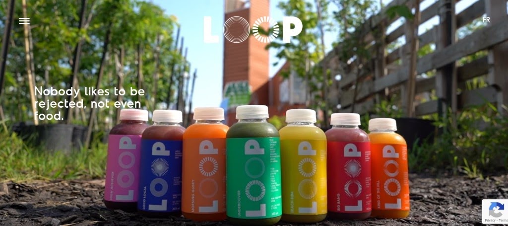
Every category page is listed in the navigation menu using unconventional page names such as Juicy Stuff, Boozy Stuff, Bubbly Stuff and Soapy Stuff. It’s a clever and funny way to showcase the friendly, informal brand voice.

The brand visual identity immediately shines through the colorful packaging design, while videos featuring team members and their accomplishments tell the behind-the-scenes story in a very compelling way.
B2B Website Design Example #2: TM
Black and white contrast accompanied by sleek and modern design is what sets the TM website apart. This product design company has what it takes for an effective website:
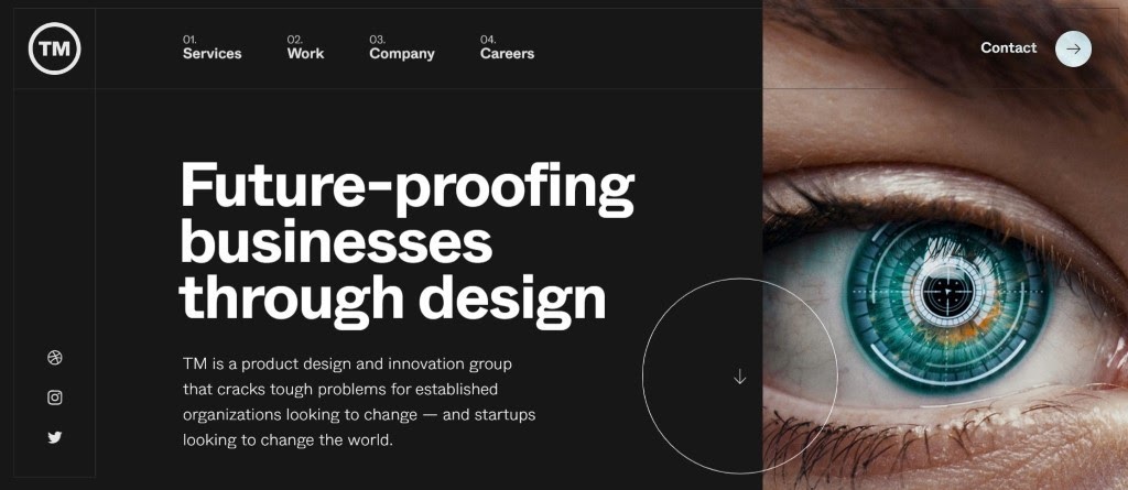
- A high color contrast
- Original images in the hero section
- A clear and concise value proposition up front
- Compelling copy that speaks their audience’s language
- Custom-made animations
- Detailed case studies to showcase previous work

All in all, a minimalistic approach with clear lines, a lot of white space and highly engaging copy is what makes this website stand out.
B2B Website Design Example #3: Playground
Playground is a design studio with one of the most playful and colorful websites out there.

A words-only hero section speaks clearly about the services they offer, while delighting users with a hovering effect that changes the color of letters.
To keep the contrast on the highest level, the rest of this one-page website is full of portfolio images and videos divided by category. Bold and bright imagery makes Playground’s design style instantly memorable.

Sometimes, one page is enough to paint a picture and convey a clear message to a target audience, even for B2B companies.
B2B Website Design Example #4: Honext
Power is in simplicity and that’s exactly what makes the Honext website an excellent example of a well-designed B2B website. It features a simple navigation bar, a soothing color scheme, clear copy and a well-balanced layout with just the right amount of white space.

Because this is a company that turns away from linear production and slides into circular economy, adding a slider that connects the first and the last step of their material-building process is an excellent idea.

Run by engineers, paper mill professionals, architects and individuals who care about the future of our planet, Honext is a good example of how B2B website can look both professional and unconventional, even though it’s operating in a highly technical niche.
B2B Website Design Example #5: BASIC®
Bold typography, clear messaging and original images in the above-the-fold area, a reel video that follows, hover-triggered transitions and brand consistency throughout the site are only a few of the efficient features of the BASIC® website.
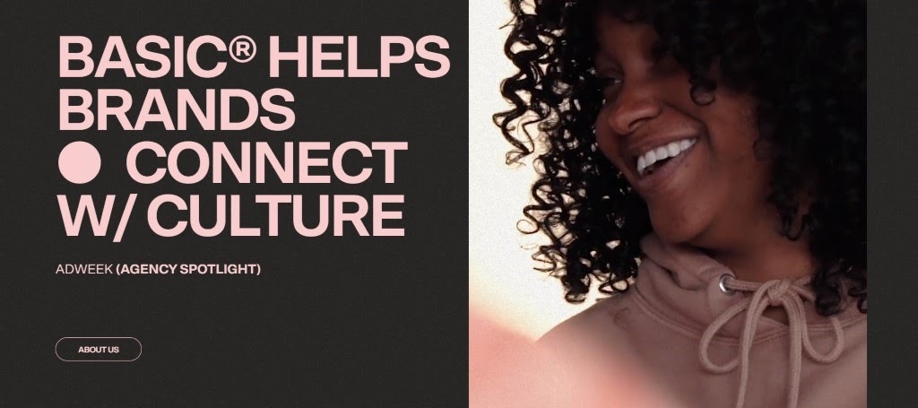
Another interesting feature of this website is an additional three-doted menu beside the main navigation bar. What hides behind this menu is a collection of internal projects and initiatives with separate websites, which completes the brand’s story.

When it comes to content published on the website, instead of a Blog section, there is a “Thinking” page leading to the agency’s podcast, BRANDBEATS® and a panel series and thought-leadership platform APPLIED®, where team members share perspectives related to strategy, design and technology.
B2B Website Design Example #6: Agendrix
Straightforward, clear and Information-rich copy perfectly aligned with images, illustrations and real-life examples throughout the Agendrix website starts this SaaS business website off with a good first impression.
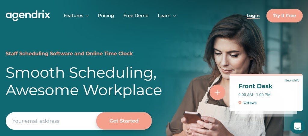
Agendrix is an employee scheduling software and it provides a library of resources on the website.
Along with a blog containing industry insights, there is a large number of free downloadable guides, templates, sheets and forms to help managers hire, onboard and manage employees. You get an automated email with the download link and asked to opt-in for the newsletter, so they could use a marketing tool like HubSpot to follow up with interesting leads.
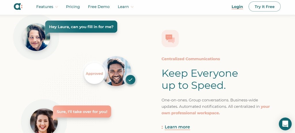
A strong brand personality speaks through the specific color scheme and the navigation drop-down menus are also tailored to suit the brand’s style. The use of color to emphasize details in written content adds a nice stylistic touch to the overall experience.
A stand-out brand personality and a pool of valuable content relevant to the target audience helps Agendrix build trust and be recognized as one of the top leaders in the industry.
B2B Website Design Example #7: Waaark
The website for the Waaark creative web studio has a very distinctive visual appeal. It introduces visitors to the site with eye-catching and aesthetically pleasing illustrations, animations and motion design elements right from the start.
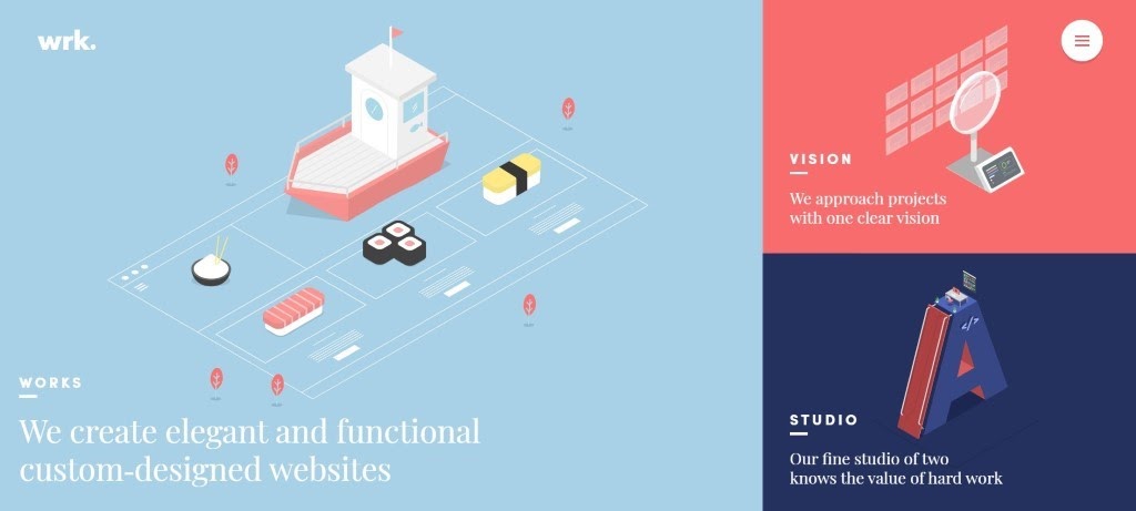
The design concept is based on the “what you see is what you get” approach. There is no possibility of scrolling down the home page. The three separate boxes on the Home page represent the three additional pages, although there is a navigation menu as well.
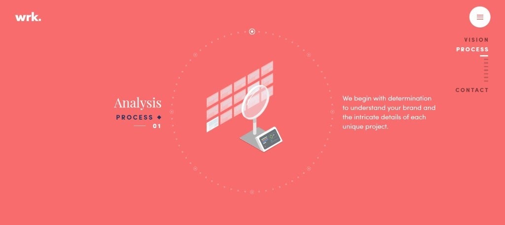
Scroll function on other pages doesn’t trigger actual scrolling either, but it instead triggers the change of scenery above the fold. Everything on this site happens in the hero section. It’s unique, it’s interesting and it surely make this website stand out from the crowd.
B2B Website Design Example #8: CallRail
CallRail is a SaaS company that offers call tracking, conversion intelligence and marketing analytics to businesses of all shapes and sizes.

Even with a lot of different services and solutions, they’ve managed to simplify complex navigation by using custom-illustrated icons and informative UX copy.
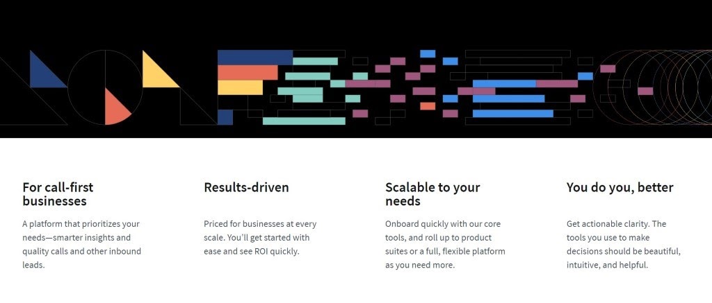
A benefit-oriented value proposition and a clear, highly visible CTA button in the hero section of every page leaves an excellent impression and invites visitors to explore further.
Detailed, informative and thoughtfully crafted web copy that uses simple, jargon-free language is what sets this website apart, along with custom imagery, consistent design elements and splashes of bright colors around the site.
B2B Website Design Example #9: Fibery
Not with one, but with four different home pages – named Freedom, Connect, Build and Anxiety – Fibery is quite an interesting example of a SaaS website.
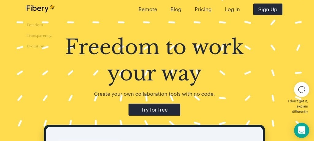

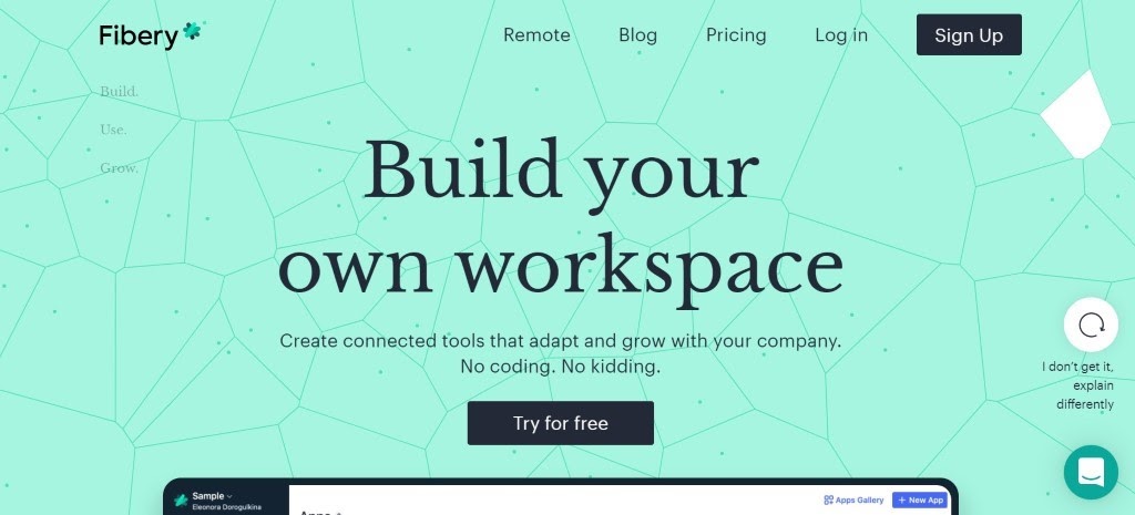
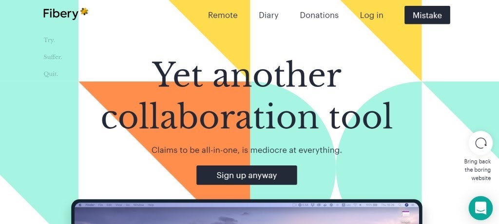
Each of the Home pages has a different look and feel and addresses a different target audience. An exception to this is the Anxiety page, which was made just for fun as Fibery’s founder Michael Dubakov explained in his Medium post.
As it turns out, that funny page is what brought 2,000 new users to Fibery in just a few days and helped the company gain an unexpected visibility boost in a highly competitive market – project management software – while still in Beta phase.
Apart from different key messaging and highly engaging, informative content on every page, interesting hover effects and scroll-triggered animations make this website unique and helps the brand stand out.
Conclusion
Because they target C-level executives, managers and decision-makers across a range of industries and specific niches, B2B companies usually hold on to conventional, strictly professional web design.
But it doesn’t have to be that way.
B2B companies can still stay true to their target audience even when they decide to implement bold typography solutions, experiment with key messaging and play with design elements.
These business-to-business website examples are living proof that thinking (and designing) outside the box can help you create highly effective websites, grow your client base and drive your business to success.

